使用 SVG 实现的炫酷效果

#SVG
更多关于 SVG 的内容。请注意,示例代码是用 JSX (或者说 React) 编写的,而不是普通的 HTML。
#Animated Wires
使用 line 或者 path 创建线条。
<svg viewBox="0 0 50 50" className="bg-neutral-900 max-w-[100px] mx-auto">
 <g>
  <line x1="0" y1="0" x2="0" y2="50" stroke="white" strokeWidth="1" />
 </g>
</svg>
将其制作成蒙版。
<svg viewBox="0 0 50 50" className="bg-neutral-900 max-w-[100px] mx-auto">
 <g>
  <rect x="0" y="0" width="50" height="10" fill="red" mask="url(#line)" />
  <mask id="line">
   <line id="" x1="0" y1="0" x2="0" y2="50" stroke="white" strokeWidth="1" />
  </mask>
 </g>
</svg>
添加动画。
<svg viewBox="0 0 50 50" className="bg-neutral-900 max-w-[100px] mx-auto">
 <g>
  <rect
   x="0"
   y="0"
   width="50"
   height="10"
   fill="red"
   mask="url(#animated_line)"
   style={{
    animation: "to-down linear infinite 2s",
   }}
  />
  <mask id="animated_line">
   <line x1="0" y1="0" x2="0" y2="50" stroke="white" strokeWidth="1" />
  </mask>
 </g>
</svg>
@keyframes to-down {
 0% {
  transform: translateY(-10px);
 }
 100% {
  transform: translateY(50px);
 }
}
添加样式。
<svg viewBox="0 0 50 50" className="bg-neutral-900 max-w-[100px] mx-auto">
 <g>
  <line x1="0" y1="0" x2="0" y2="50" stroke="rgb(50,50,50)" strokeWidth="2" />
  <rect
   x="0"
   y="0"
   width="100%"
   height="20"
   fill="url(#line_color)"
   mask="url(#animated_line_fancy)"
   style={{
    "--height": "20px",
    animation: "to-down-2 linear infinite 3s",
   }}
  />
  <defs>
   <linearGradient id="line_color" x1="0" x2="0" y1="0" y2="1">
    <stop offset="0%" stopColor="rgba(255,0,255,0.1)" />
    <stop offset="100%" stopColor="rgb(255,100,255)" />
   </linearGradient>
  </defs>
  <mask id="animated_line_fancy">
   <line x1="0" y1="0" x2="0" y2="50" stroke="white" strokeWidth="2" />
  </mask>
 </g>
</svg>
@keyframes to-down-2 {
 0% {
  transform: translateY(calc(var(--height) * -1));
 }
 100% {
  transform: translateY(100%);
 }
}
这些类似的效果大多使用了相同的技术。遮罩一个动画块,添加一些动画效果,并可能在 Figma 或其他 SVG 编辑器中设计某些部分。 Unkey 的着陆页就是一个很好的例子。
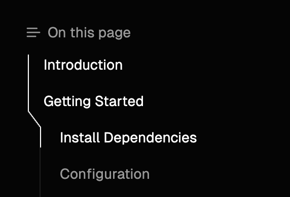
#Clerk TOC
我在 Fumadocs 上制作了一个类似 Clerk 风格的目录 (TOC),您可以尝试并体验一下这个漂亮的 TOC。
为了实现它,我们必须在服务器端渲染 TOC 轮廓,而无需客户端 JavaScript,以使其与 SSR 兼容。
因为我们在服务器端,所以我们不知道元素的精确位置。我的方法是使用 absolute 定位,将轮廓渲染为不同的“组件”,并将它们拼接在一起。
这并不难,但我们还希望渲染轮廓中突出显示的部分,这些部分对应于当前活动的条目,或者其相应的标题在视口中可见。
例如:

我将其称为 thumb。它必须是动画的,所以我们不能简单地更改这些轮廓组件的颜色。
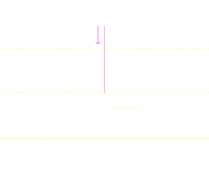
我们无法使用简单的 CSS 解决方案来动画 thumb,幸运的是,我们拥有 TOC 条目的精确渲染位置,因为 thumb 是交互式的,所以它是在客户端渲染的!
利用来自浏览器的信息,我们可以在客户端构建一个“蒙版映射”,如下所示: 构建这个映射的方法是 SVG - 是的,我们的老朋友。
<svg xmlns="http://www.w3.org/2000/svg" viewBox="0 0 14 236">
 <path
  d="M1 0 L1 20 L13 36 L13 56 L1 72 L1 92 L13 108 L13 128 L1 144 L1 164 L1 180 L1 200 L13 216 L13 236"
  stroke="white"
  strokeWidth="1"
  fill="none"
 />
</svg>
SVG <path /> 的 d 属性不是一个无意义的自动生成字符串,而是一个命令列表。有关更多详细信息,请参阅 Web Docs,它是一个非常强大的工具。
使用我们的新工具,我们可以告诉 SVG 渲染一条连接轮廓上每个点的线。
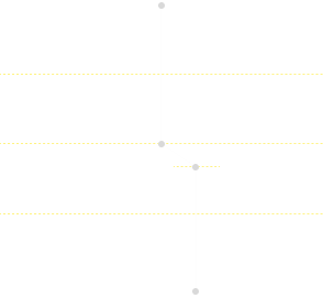
这样就构建了一个与我们在服务器端预渲染的原始 TOC 轮廓 完全相同 的 SVG。
类似于我们从 Animated Wires 中学到的技术,我们可以使用 CSS mask-image 属性来遮罩一个动画 div 块,以渲染 thumb - 轮廓的突出显示部分。
<div
 style={{
  maskImage: `url("data:image/svg+xml,${
   // URI encoded SVG image
   encodeURIComponent(
    `<svg xmlns="http://www.w3.org/2000/svg" viewBox="0 0 14 236">...</svg>`
   )
  })`,
 }}
>
 <div
  style={{
   width: 1,
   height: thumb.height,
   transform: `translateY(${thumb.top}px)`,
   transition: "all 500ms",
   backgroundColor: "white",
  }}
 />
</div>
查看 源代码 以查看我在 React.js 中的实现。
非常感谢 Clerk 在这方面的启发,我从未想过文档站点的 TOC 会如此有趣。
Last Updated:Tuesday, August 20, 2024
Fuma Nama
An open-sourcerer.
Leave comment
Sign I